So I’m back to dabbling with Google Chrome as my main browser, backpedaling somewhat on last year’s [yet another] switch to Firefox. Technically I’m running Chromium, the less Googley version of Chrome on Linux, and Google Chrome stable on Android and Chrome OS.
This isn’t a post delving into why I’m switching things up, or why I’m not opting for a more privacy-centric Chromium-based browsers like Brave. This is a post about getting rid of those god awful window borders that you get out of the box that don’t quite marry up with the other applications I run.
Google Chrome / Chromium (which I’ll refer to as Chromium the rest of this post) has a few different options to configure the look and feel of the window
decorations / borders.
The settings we need to concern ourselves with can be found by opening up
Chromium’s settings, or simply navigating to chrome://settings.
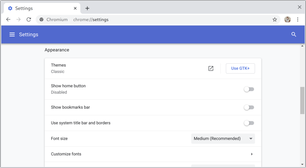
Under the appearance section you’ll find a couple of options, Themes and Use system title bar and borders. With the system title option disabled and the classic theme enabled, your browser probably looks something like this:

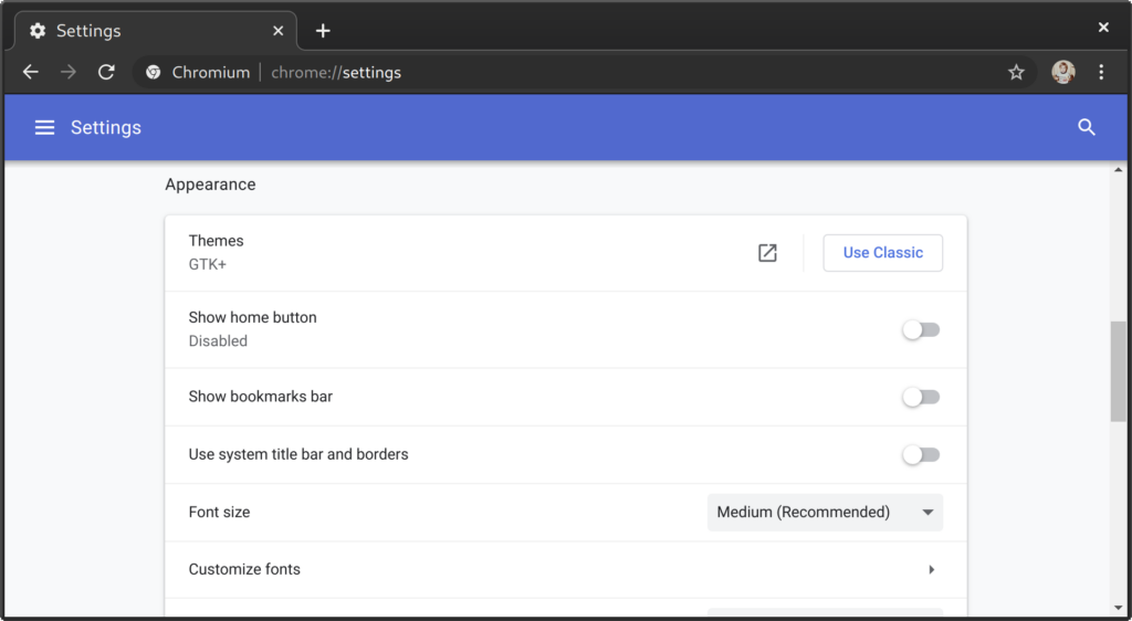
Nothing terribly, but if you’re using a dark theme like I am, the window looks totally out of place. By clicking on Use GTK+, Chromium will start to look a bit better, by matching your system theme a bit better:

Close, but my theme (Adwaita Dark) doesn’t have that light border / bevel on the windows. In fact, I have intentionally disabled title bars, so if my next screen capture doesn’t look quite like yours, that’s probably why.
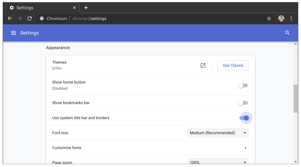
The next step is to enable the Use system title bar and borders options which gets rid of that ugly border entirely:

That’s all there is to it, two options to finally get Chromium looking like it belongs instead of looking like a KDE application running in GNOME or vise
versa.

